 15 July 2026
 Share
Share
1
Creating a calm and inviting atmosphere in your home starts with choosing the right colors. Calm colors help reduce stress, promote relaxation, and make your living spaces feel more welcoming. Whether you’re redecorating a single room or your entire home, understanding how to pick soothing colors can make a big difference. In this post, we’ll explore practical tips to help you select calm colors that suit your style and enhance your home’s ambiance.
Calm colors generally have a soft, muted, or cool tone, which can help create a serene environment. These colors are perfect for bedrooms, living rooms, or any space where you want to unwind. Unlike bold or bright colors, calm hues tend to be less stimulating, making it easier to relax and feel comfortable.
Before diving into tips, it’s useful to know which colors are typically considered calming:
– Soft blues: Often associated with the sky and water, soft blues encourage tranquility.
– Muted greens: Remind us of nature and promote balance.
– Gentle grays: Provide a neutral, peaceful backdrop without overpowering.
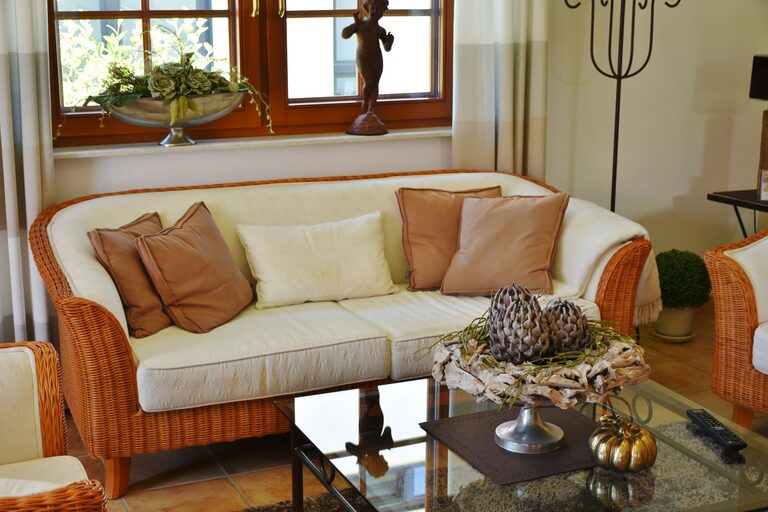
– Warm beiges and creams: Create a cozy, inviting atmosphere.
– Lavenders and soft purples: Add a soothing touch without being too bold.
Think about how you use the room. Bedrooms and meditation spaces benefit from very soft, cool colors like pale blue or green. Living rooms can handle a bit more warmth, such as soft taupe or gentle peach tones, which still keep things calm but add a welcoming feel.
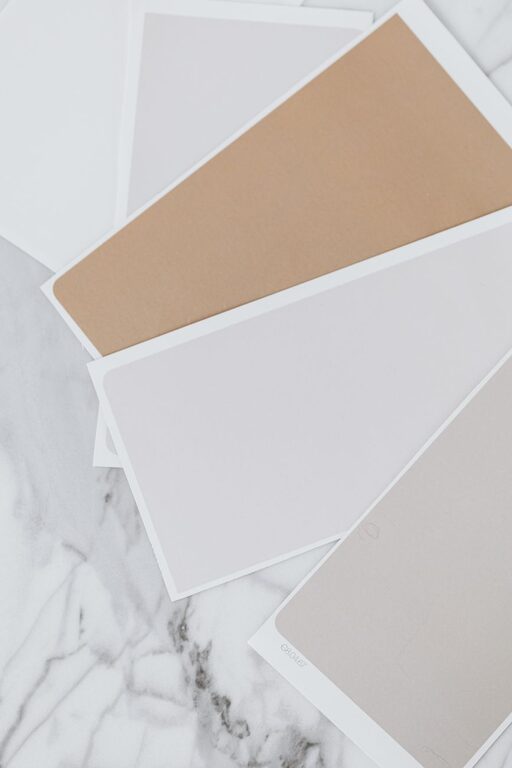
Paint colors can look different depending on lighting and room size. Always buy small paint samples and try them on your walls. Observe the color throughout the day to see how it changes with sunlight or artificial light.
Starting with neutral colors like off-white, beige, or light gray gives you flexibility. Neutrals won’t overwhelm, and they work well when paired with soft accent colors such as pale blue or sage green.
While cool tones tend to be calming, sometimes a warm hue can add comfort and coziness without creating distraction. For example, a soft beige paired with muted blue creates a harmonious balance.
Don’t be afraid to mix different shades of the same calm color to add depth without losing tranquility. Textured fabrics, rugs, and cushions in similar tones also contribute to a soothing environment.
Calm colors often work best when the palette is limited. Choose two to three colors and stick to them throughout the room to avoid visual clutter.
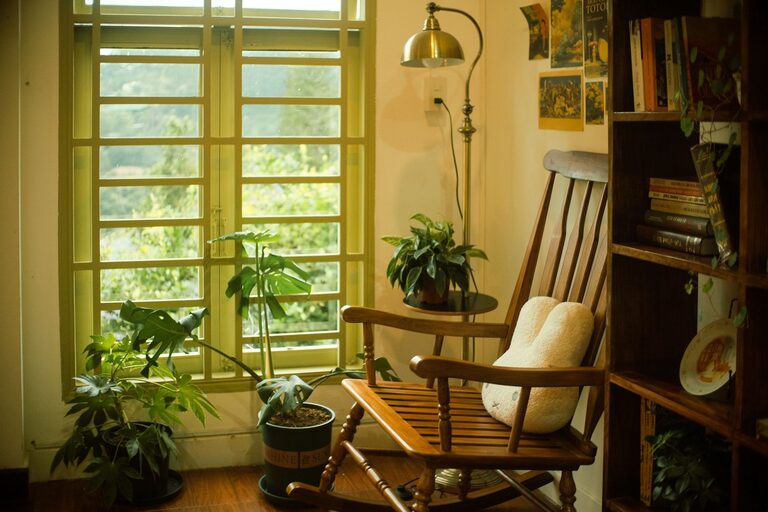
Colors inspired by nature — like gentle greens, sandy beiges, and soft blues — naturally promote relaxation. Including plants or wood furnishings can complement these colors beautifully.
Even soft colors can turn too bright or too dark when overused. Bright pastels might feel too energetic, while very dark hues can make a space feel heavy or closed in. Aim for medium to light shades.
Besides paint color, consider these design elements:
– Lighting: Soft, warm lighting enhances calmness.
– Minimal Clutter: A tidy space feels more peaceful.
– Natural Light: Maximize windows to bring in daylight.
– Comfortable Furniture: Soft textures and cushions help relaxation.
Choosing calm colors for your home is about creating a space where you feel at ease. By focusing on soft, muted tones, balancing warm and cool shades, and considering natural elements, you can design a peaceful environment that suits your lifestyle. Remember to test colors in your own space and keep your palette simple. With these tips, your home can become a tranquil retreat you look forward to coming back to every day.